Beyond landscape: development of a major healing garden
Healthcare in China is expanding faster than anywhere else on the planet and the impact of multiple, mega-medical centers on their communities, their culture and their general way of life are substantial. In 2015, Payette was commissioned to design a new, 2,500-bed academic medical center for a growing quadrant of Changsha, the capital city of the Hunan Province. A beautiful, elegant city sitting on the bank of the Xiang River, Changsha has long been known for its intellectual leadership, the arts and its love for extensive landscapes. The site for the new hospital, while extremely accessible and appropriate for the smart-growth concepts of the community, is set on a piece of land separating the adjacent housing complexes from a major public park. As is typical in China, the housing is extremely dense and the park served an important role in opening up the space and allowing a large population somewhere to decompress. Immediately, the design team focused on a concept of hospital development that ensured, if not celebrated, maintaining the relationship of the neighborhood to the park. This connective tissue (Figure 1), tying all of the elements together, would be a major outdoor space; a landscape that would extend beyond the traditional healing garden and embrace a much deeper purpose for the overall campus.
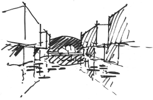
The design began by addressing an interesting and fundamental question. How large does a mega-medical center have to be before it overwhelms the user; the patient, visitor, staff, or even the community itself? In many instances of mega-medical center design, large platforms are created on which a series of efficient patient towers are placed. The towers are aligned as a series of blocks, structured in a row (Figure 2). The concept is operationally and structurally efficient and, if sized and separated properly, quite effective, but at what cost? While it is true that once inside, a single user will not perceive the massiveness of the overall facility, the impact on the site and the perceptive weight of the building will have a negative impact on the surrounding community. Understanding that there is no formulaic response or exact calculation to determine success, the design team, considering a number of factors including mass, material, height and the makeup of the surrounding community, decided the facility needed to be separated into two volumes with a substantial open space in between. The operational methodologies of separating the hospital into two were complex and eventually solved with an extensive study of resource movement management and the result was worth the effort. The site became two distinct buildings, linked with a single entry zone, similar to an airport arrival area, with a substantial healing garden in between to tie the buildings together and provide a significant community asset that links the current pedestrian pathways and the neighborhoods to the existing park.
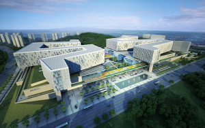
The area in between was not identified randomly, but calculated with a number of core design concepts that brought rigor to the conversation. The design team set the overall width of the garden by studying both the usable footprint of the diagnostic platform along with the solar exposure of the landscape (Figure 3). The resulting block of space was then tested against the required program. Once the team was satisfied with the open space, the two resulting building blocks were studied at their “edges” to ensure they would fit properly within the buildable setback. The overall effect of the garden allows the two mega-structures to seem independent, provides a framed view of the mountain park and allows for significant views from all patient rooms without having the standard tower to roof to tower sight lines. Simply stated, allowing a five million square foot facility to be broken into two distinct structures, instead of one mega-hospital, significantly reduces the visual impact and creates a better neighbor.
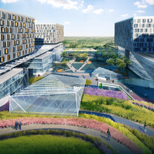
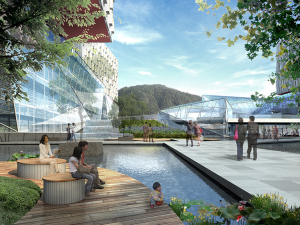
As the design team began looking at the garden, we started with a simple goal. Traditional healing gardens are positive influences on any medical space (Figure 4). Very few will deny the benefits associated with connecting people to the outside, the value of natural light and the general strengths associated with escaping the built environment, but given the magnitude of this specific garden, the design team felt a need to create more purpose for its existence. The team set a goal to create an element just as important to the hospital as any critical department. The methodology identified concepts, not necessarily unique to this project alone, but that collectively show immense value to the operational and functional goals of the institution. The team, after a number of conceptual iterations, settled on three major initiatives focused on delivering value to the users, to the facility and to the community, to make this vision a reality (Figure 5).
Value to the users
When considering value to the user, it was important to remember every user, including the patient, their visitors and the staff, and to focus primarily on built elements that could help to reduce stress and aid in the healing process. With this in mind, we wanted to address the needs of the garden at the initial entry point of the medical center, and then examine the interior garden functions specific to the patient/visitor and to the staff.
Stress management begins at the front door
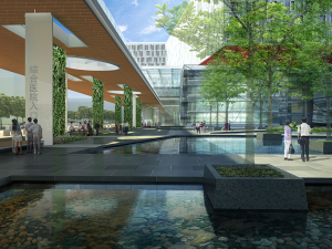
At any well-designed medical center, stress management is a key driver for all users. Many factors contribute to the overall stress level of any given user, many of which cannot be influenced by the built environment, but for those that can, that management begins upon arrival. With large medical centers, the entry sequence is usually overcrowded and chaotic. A study of the surrounding university hospitals in the Changsha area revealed nothing to dispute this fact. The design team separated the arrival and entry component from the base design of each hospital, looking at this element as a single design challenge. This is not uncommon in projects of this magnitude, but in this instance, the role, design and placement of the garden was seen as key component to the success of that sequence. By allowing the primary on-grade arrival point to be focused on an open-air structure that spanned between the two facilities, in lieu of the more traditional approach of “front door arrival”, the initial visual focal point was to an outdoor waiting area fronting a major healing garden with powerful views up the mountain to the adjacent park. This placement of the arrival area not only uses the garden visually to reduce stress, but allows for a non-operational space to accept vehicular and pedestrian visitors providing a larger space for orientation without compromising the functionality of the registration process. By forcing a large visitor population to gain initial orientation in an open space before moving into a smaller, more function driven space, the crowd-factor associated with inefficiency is reduced. For many patients, initial arrival stress is a function of having to exit a vehicle and immediately enter the “medical process”. The garden allows someone to arrive and then choose to “take a breath” before electing to move forward. The design team considered this to be the first focused user of the garden and structured the design of the initial garden zone, the arrival area, to assist this population. Allowing someone to gain orientation at the earliest point and providing for independent wayfinding will positively affect initial stress levels before users even enter the facility.
How the patients/visitors view the interior garden
When setting up the healing garden, the initial planning exercises focused on zoning the available area into a collection of spaces based on definable comfort (Figure 6). The team considered: what types of spaces are needed, what are the characteristics of each space and where will each be placed within the overall circulation pattern? Most important, for each use, what is the appropriate size and how will it be defined to provide both a feeling of personal comfort and freedom. The zones included: an open area for arrival, intimate seating areas for three to four, landscaped seating for a crowd and personal pull-off spots for personal meditation. The design team established criteria for each area and placed pockets of spaces within and along meandering pathways that generally comprised of organic forms intended to offset the hard edges of the building.
An extensive water element was also included in the design, and while a common element in many healing gardens, the team wanted to ensure we could justify the expense by evaluating it against two key factors: sustainability and environmental comfort. Changsha has a relatively high rainfall average and with the site positioned adjacent to the park, the collection of natural water was deemed viable. The environmental comfort conditions were satisfied through an evaluation of noise buffering and temperature control. The garden site sits in a built canyon between two large structures and while being open to the park helps significantly, the design team worried about the noise generated from the arrival zone and adjacent six-lane roadway. The movement of the water in the space, including a number of gentle falls, generated enough white noise to positively affect the smaller waiting nooks and create real value.
Value to the staff
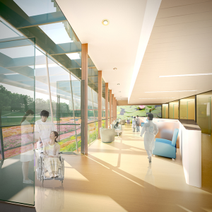
Often, the staff is a forgotten element when it comes to determining design elements and their value, but this population, their satisfaction with their overall work environment and their resulting stress levels, can have extreme effects on patient healing. A key issue when conceptualizing mega-medical centers is the access to outdoor space, the distance to it and the quality of it. Small roof gardens and pocket parks are good for immediate access and quick breaks, but they can still be viewed as cold, tight and institutional. Given the volume of caregivers in the complex, the design team wanted to create a staff-centric community space open to all and truly usable. Two elements built into the design that helped to ensure this were: direct access from intense staff areas, including surgery, and segregated areas from the general public. The design team used the slopes of the land to reach back and access core staff areas, on multiple levels, directly from the diagnostic and treatment zones. Quicker access ensured more staff members will be able to use the garden in an efficient manner. Additionally, a section of the garden is envisioned to sink down one level and provide outdoor gathering/eating space adjacent to the staff cafeteria. It is important to allow staff to relax, congregate and enjoy some collaborative time free of patient/family interaction. The pressure on caregivers in any culture is high and to reduce stress we must remember that they are human as well.
Value to the facility
When examining the design of the garden with respect to facility value, a number of core concepts were generated including the ability to justify outdoor space by offsetting indoor space. In the 1970’s Payette designed a seminal project for the Aga Khan University. One of the core features of the campus, interior plazas, initiated the firm’s love and study of embedding nature into the heart of a function driven program. This concept is particularly valid when considering mega-medical centers in cultures with high visitor volume. In Changsha, it is quite common for a large number of visitors per patient to access the facility more frequently and for longer periods of time as compared to their US counterparts. These visitors require a greater space allocation, more variety of space types and more diverse services to properly accommodate them. The types of spaces required just for traditional waiting alone would include larger, open areas for family gathering, smaller areas for interactions with children and personal space for intimate conversations. Considering the sheer volume of activity generated by a 2,500-bed facility, the space allocation for these services can be programmatically and financially overwhelming. When generating the initial concepts for the Fifth Xiangya Hospital, the design team calculated the space required, based on the anticipated volumes, and allocated these areas as a series of physical spaces in the program and in the conceptual bubble diagrams. As the design advanced, the spaces were then considered either indoor or outdoor program, but none of the area was simply designated as “exterior space”. By creating the garden in this way, not only was the size of the space defendable, but the use was easier to assign and provided a more focused series of design parameters. The use of exterior space to eliminate indoor, structured and conditioned space, can be extremely beneficial to the overall project budget and therefore viability.
Value to the community: reducing the impact on the community
The addition of a major medical center to a growing community, especially to a population as underserved as Changsha, is moving urban growth forward intelligently, but the building typology required to provide the level of service necessary can overwhelm a surrounding community. Aside from the obvious physical impact, the functional changes a complex of this magnitude will have on the daily movement patterns of the residents. Currently, the pedestrian movement patterns along the site, to and from the park and laterally to the commercial district are both robust and essential to daily life. It is critical that developments of this size enhance and support the cultural landscape of an existing community. The design team adopted three core ideas with respect to strengthening the pedestrian experience which included enhanced park access, activating the access area with educational opportunities and centralizing access to a robust public transportation node. These three core opportunities focus on the garden itself and support its position on the site.
The current park, while central to the community, had a weak access point from the leading edge of the property. The garden envisioned for the hospital has essentially three sides. The two side edges are framed by the two hospital blocks and are quieter, allowing for limited access points focused more on the functions of the medical center. The front edge, centered on the arrival zone for the overall complex, was designed to be open and prepared to accept a larger volume of pedestrian movement without the perception of controlled access. By developing a true entry portal to the healing garden, the hospital is actually acting as a structured entry to the park itself. To drive additional volume to the park in a meaningful way, the healing garden also provides public access to hospital-based educational programs. The medical center administration envisioned the ability to engage the neighborhood with wellness lectures, classes and preventative care, using the garden as a gathering place or open-air amphitheater. To support continued urban growth in the region, the city is enhancing the public transportation with a more robust bus service and future underground tram. The design team incorporated both the bus system collection point and the main pedestrian access path to the tram to coincide with the park access edge. Not only was this a sensible design decision for the actual users of the medical facility, but also provided a structured outdoor space to support an important community gathering point. All three core concepts provided enhanced purpose for the garden’s existence and allowed the complex to add to the overall enhanced livability of the surrounding community. While these are not direct design details of the healing garden itself, they are important design drivers that represent how important this type of space can be to the overall mission of a hospital.
Conclusions
When the design team envisioned the need to separate the mega-medical center into two distinct volumes, separated by a healing garden and focused on a major public park, no one would argue with the core design part, but reality forces a good design process to consider each and every element of a project for viability by weighing its impact against its cost. Payette knew what needed to be done to create a true healing environment for the Fifth Xiangya Hospital, but a deeper dive into the components, use and value of the garden allowed us to examine not only the physical design of this element, but how we approach key landscape zones for every building. Examining first the users allows a team to break down the individual characteristics of each group and ensure the design has been optimized for everyone. Looking at the element from a facility standpoint generated a number of ideas including built program reduction and sustainable central plant concepts we may never have considered, and testing the campus design against the community simply reminds us all of our larger responsibility to look beyond the boundaries of the site and remember the impact our designs have on a broader community. By looking deeper for value in our healing garden, our design became more focused and eventually more successful.
Acknowledgements
None.
Footnote
Conflicts of Interest: The author has no conflicts of interest to declare.


